Previous Next
Visualizing data
One of the first tasks when working with some new data is to try to understand what's in the data, and how it is structured.
Stats
Perhaps the most commom way of visualizing some data is to list some basic stats about each of its attributes. For example, let's take a look at the iris dataset (which you can download from MLData.org).
waffles_plot stats iris.arffThis is one command that you should probably memorize, because you will use it frequently. Here is its output:
	Filename: iris.arff
	Patterns: 150
	Attributes: 5 (Continuous:4, Nominal:1)
	  0) sepallength, Type: Continuous, Mean:5.8433333, Dev:0.82806613, Median:5.8, Min:4.3, Max:7.9, Missing:0
	  1) sepalwidth, Type: Continuous, Mean:3.054, Dev:0.43359431, Median:3, Min:2, Max:4.4, Missing:0
	  2) petallength, Type: Continuous, Mean:3.7586667, Dev:1.7644204, Median:4.35, Min:1, Max:6.9, Missing:0
	  3) petalwidth, Type: Continuous, Mean:1.1986667, Dev:0.76316074, Median:1.3, Min:0.1, Max:2.5, Missing:0
	  4) class, Type: Nominal, Values:3, Most Common:Iris-setosa (33.333333%), Entropy: 1.5849625, Missing:0
	     33.333333% Iris-setosa
	     33.333333% Iris-versicolor
	     33.333333% Iris-virginica
As you can see, it shows some very basic information about each attribute in the dataset.
Overview
Another common way to look at data is to plot the correlations between various attributes. The following command will generate such a plot for every pair of attributes.
waffles_generate overview iris.arff
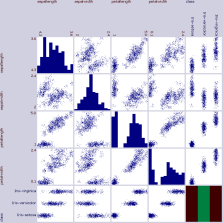
Each plot at column i, row j, shows how well the value in attribute i can predict the value in attribute j. (So, if the last attribute is a class label, then the bottom row of the correlation plot matrix is usually the one in which you will be most interested.)
As another example, here are the overview plots from a subset of the attributes in the adult-census.arff dataset. (I only show a subset here because there are a lot of attributes in that dataset.)
waffles_generate overview adult-census.arff
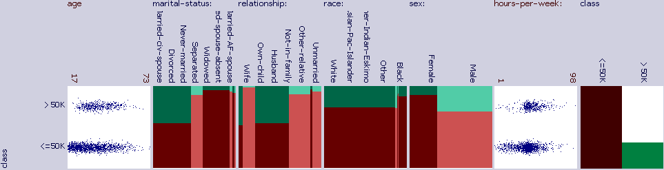
Several trends can be immediately observed in these plots. For example, it looks like most of the people in the census made less than $50K. It can be seen that age was somewhat correlated with a greater likelihood of making more than $50K. Those who indicated a marital status of "Married-civ-spouse" were much more likely to make more than $50K than those with other values in this attribute. Those who indicated that their relationship was either "wife" or "husband" were likely to make more than $50K, while those that indicated something else were less likely. It is clear from this chart that the significant majority of the people in the census indicated race to be "white", and that those who indicated "white" or "Asian-Pac-Islander" were more likely to make more than $50K than those with other values. It can be seen that males were more likely than females to make more than $50K. Apparently there were more males than females in this census. It looks like most people worked approximately 40 hours-per-week.
Anyway, the point is, you can tell a lot about a dataset just by examining the overview plots.
Histograms
Histograms are a good way to look at the distribution of some data. The following command will draw a million random values from a gamma distribution, and then plot a histogram of it.
	waffles_generate noise 1000000 -seed 0 -dist gamma 9 2 > gamma.arff
	waffles_plot histogram gamma.arff > gamma.svg
Here is gamma.svg:

Model space
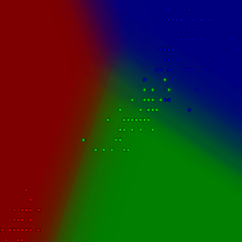
If you have a model that has been trained on some dataset, you might want to visualize that dataset with the trained model. This example will train a neural network (with no hidden layers) on the iris dataset, and will then create a visualization of that model.
	waffles_learn train -seed 0 iris.arff neuralnet > nn.json
	waffles_generate model nn.json iris.arff 2 3
Equations
You can visualize equations too.
waffles_plot equation -range -6 0 6 1 "f1(x) = 1/(1+e^(-x))" > logistic.svg

You can plot multiple equations together. Also, our tools let you define helper functions that you can use within your equations. Example:
	waffles_plot equation -range -10 0 10 10 "f1(x)=log(x^2+1)+2;f2(x)=\
	   x^2/g(x)+2;g(m)=10*(cos(m)+pi);f3(x)=sqrt(49-x^2);f4(x)=abs(x)-1"
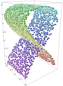
3D
You can also plot in 3D:
	waffles_generate manifold 3000 -seed 1234 "y1(x1, x2) = sin(2 * t(x1));\
	                      y2(x1, x2) = -2 * cos(t(x1)); y3(x1,x2) = 2 * x2;\
			      t(x) = 3 * pi * x / 2 + pi / 4" > in.arff
	waffles_generate 3d in.arff
Scatter plots
To make a scatter plot or line plot, use "waffles_plot scatter". Then tell it what you want to plot. Each plot requires 4 things: a color, a dataset, an attribute index for the horizontal axis, and an attribute index for the vertical axis. Example:
waffles_plot scatter blue mydata.arff 0 1 red mydata.arff 0 2 > plot.svg

If you don't want the lines connecting the dots, do:
waffles_plot scatter blue mydata.arff 0 1 -thickness 0 red 0 2 -thickness 0 > plot.svg
This tool can handle logarithmic scales, and a plethora of other useful options. To see all available options, take a look at the usage information.
waffles_plot scatter
Precision/recall
As another example, let's make a precision/recall chart. We will use the diabetes dataset (which you can obtain at MLData.org), and a naive Bayes classifier.
Let's start by making a precision/recall graph using naive Bayes. We will use 10 reps to increase the stability of our results:
waffles_learn precisionrecall -reps 10 diabetes.arff naivebayes > nb.arff
Now, let's plot this data:
waffles_plot scatter -size 800 800 blue nb.arff 0 1 red nb.arff 0 2 > pr.svgIt looks like this:

Note that all of these charts are in SVG format, so you can easily edit them with Inkscape, or the SVG editor of your choice. In this case, the labels on the vertical axis ran together, so I touched them up to make it look better.
etc.
There are a few other visualization techniques available. For a complete list, see the usage information for the waffles_plot tool.
Previous Next
Back to the table of contents